Who are our audience?
I would say they fit into several broad categories.
First, the web designer who is learning PHP.
This person isn't used to anything much more than javascript, has lots of basic php language questions, and wants to do possibly nasty things with the language.
Second, the system administrator - this person knows just enough php to know they don't want to know anymore, relies on a range of tools - from cpanel to phpmyadmin.
They are setting up a shared environment, typically. They just want results, and they want them fairly quickly.
Third, the just setting out as a seasoned developer. This person is working in PHP5, and is half a heartbeat away from leaping on the rails-bandwagon. They are looking for frameworks, quick code and things which are visually fun. They are usually working as a full time developer.
Fourth, the ultra seasoned developer. This person is working in PHP5, has a background in Java or other languages, and wants to Do The Right Thing. They are usually working as a full time developer - they use unit tests, design patterns, and are often willing to provide patches.
Probably categories three and four overlap markedly.
Scenarios
Ultra seasoned developer has a specific design problem - database abstraction
The last 3 projects they have worked on have used the mysql extension, ADODB, and others.
They type in 'database abstraction php'; and among the results is PEAR::DB.
The first few links are newbie tutorials, and thus skipped.
When viewing the PEAR::DB homepage, they note it is unmaintained, and MDB2 should be used.
Wanting to know more, they click into the documentation, and read the end user docs.
From here, they see a few samples of code.
Convinced to at least try it out, they then turn to install it.
Newbie has been told to RTFM and learn about PEAR
Using newfound google prowess, the newbie discovers pear. They have been told to go and read the manual about mail(), and want to know how to send attachments.
They land at http://pear.php.net/ and click around a little bit.
They eventually discover the Packages section.
Here, they eventually find a package they want - PEAR::Mail.
They get to the package homepage.
They hit the download button, and are given a .tar.gz - being mostly a windows user, this stumps them.
A system admin at a small web hosting company has had a user complain that fictionalbb doesn't work: it has some error about HTML/QuickForm.php
The system admin pastes the error message into google, and lands on a forum post.
The forum post tells them they need to install HTML_QuickForm, and it's this thing called a PEAR package.
They land on pear.php.net. They give up after a short period, as there doesn't appear to be anything useful.
Instead, they type 'ubuntu html_quickform howto' or 'redhat fictionalbb install' into google.
Somewhere, they locate a forum post, which eventually leads them to the right answer.
How can we make these user stories better?
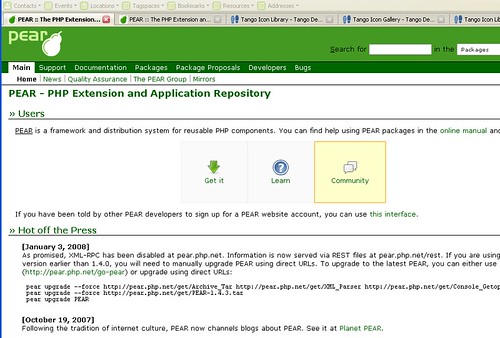
First, when you land on the front page, there should be a clear direction.

Ask the user what they are trying to accomplish, and direct them to the resources they need.
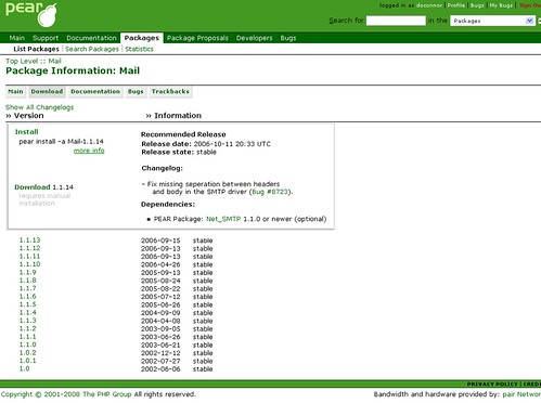
Second, make the package download page more useful.

If you have no idea how to install pear, you are going to end up trying to download.
This page should provide you with more direction, and links to 'installing pear'
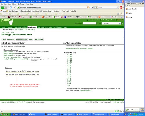
Third, when they land on the package documentation page, give them an instant teaser.

Show the table of contents right there and then, rather than hide it away.
Provide a spot for useful external articles to make the selling process better.
If the user can read and understand right there and then, they'll be happier.
6 comments:
There are excellent suggestions, especially the home page and install parts. Very easy to implement. The documentation part might be a little more work, but certainly worth the effort.
These are indeed some good UI ideas... +1
Bug 13540 will hopefully make the download page look like
this
Some of these look like a good idea but the whole tutorial part might be too much, it means we'll have to make sure those links stay alive, that they are of sufficient quality etc etc etc ... a bit of a headache on top of everything.
Re the table of contents, that's a good idea but I've been pitching a different idea to Hannes (bjori) in regards to phpdocumentor + phd and how we can properly twine those things together so we don't need the distinction between api docs and end user docs, basically we'll have integrated api into manual and some way to browse old APIs
The download part: make a bug report if you haven't already
Front page stuff: we have to find better icons, perhaps get an artist to make it, we can probably get one of the tango guys to help us.
We also might want to juggle the news / new release / top download thing, I have some ideas that we should discuss
> The download part: make a bug report if you haven't already
Done, with shiny patches
> Re the table of contents, that's a good idea but I've been pitching a different idea to Hannes (bjori) in regards to phpdocumentor + phd and how we can properly twine those things together so we don't need the distinction between api docs and end user docs, basically we'll have integrated api into manual and some way to browse old APIs
Got a link / mailing list post / other?
> Front page stuff: we have to find better icons,
Yup, yup & more yup!
No, we've mostly been chatting on irc, casually if anything about how it can be done and how it can best work out for the whole thing.
The biggest problem will be translations, how to push it to CVS so translators can work on it ... Automagical is not very good IMHO for something delicate as a SCM tend to be but who knows ... Lets make these manual changes wait for a bit while we see how PhD Google Summer of Code plays out, we anyway need to solve the translation part first
Post a Comment