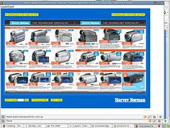
What's got my goat:
- Typing harveynorman.com.au doesn't resolve the site.
- There is no search functionality, so I cannot buy a roomba from them
- The site is a giant, unusable, junk mail website.
- Everything I click on appears to be a popup window with a flash movie in it about a product that is featured. I don't care about an action movie featuring a digital camera, I just want to know about the product.
- There is no Contact Us link of any kind, so I can't even ring someone to answer my questions, or email them in.
- I do believe I can see a MARQUE tag, filled with text. I don't care about moving text, it just gives me a headache.
- The catalog section is a flash feature of their current junk mail catalog. I can download it as a PDF, too. Best of all, the detailed text is too small and blurry for me to actually read.
Thank you, Harvey Norman, for giving me a way to experience junk mail on the web like I never have before.

If you don't get what the web is about, stay off of it! You'd never open a brick and mortar store; then provide no staff; have all of your information available only in crappy unreadable catalogs; and plaster advertising all over it.
No comments:
Post a Comment